Dialog and Drop Dialog
The Dialog and Drop Dialog patterns are used for modal parameter-entry forms. A dialog interrupts the user's workflow to collect input — confirmation, parameter values, or selection criteria — before an action proceeds. Both patterns share the concept of focused, temporary data entry, but differ in presentation and weight.
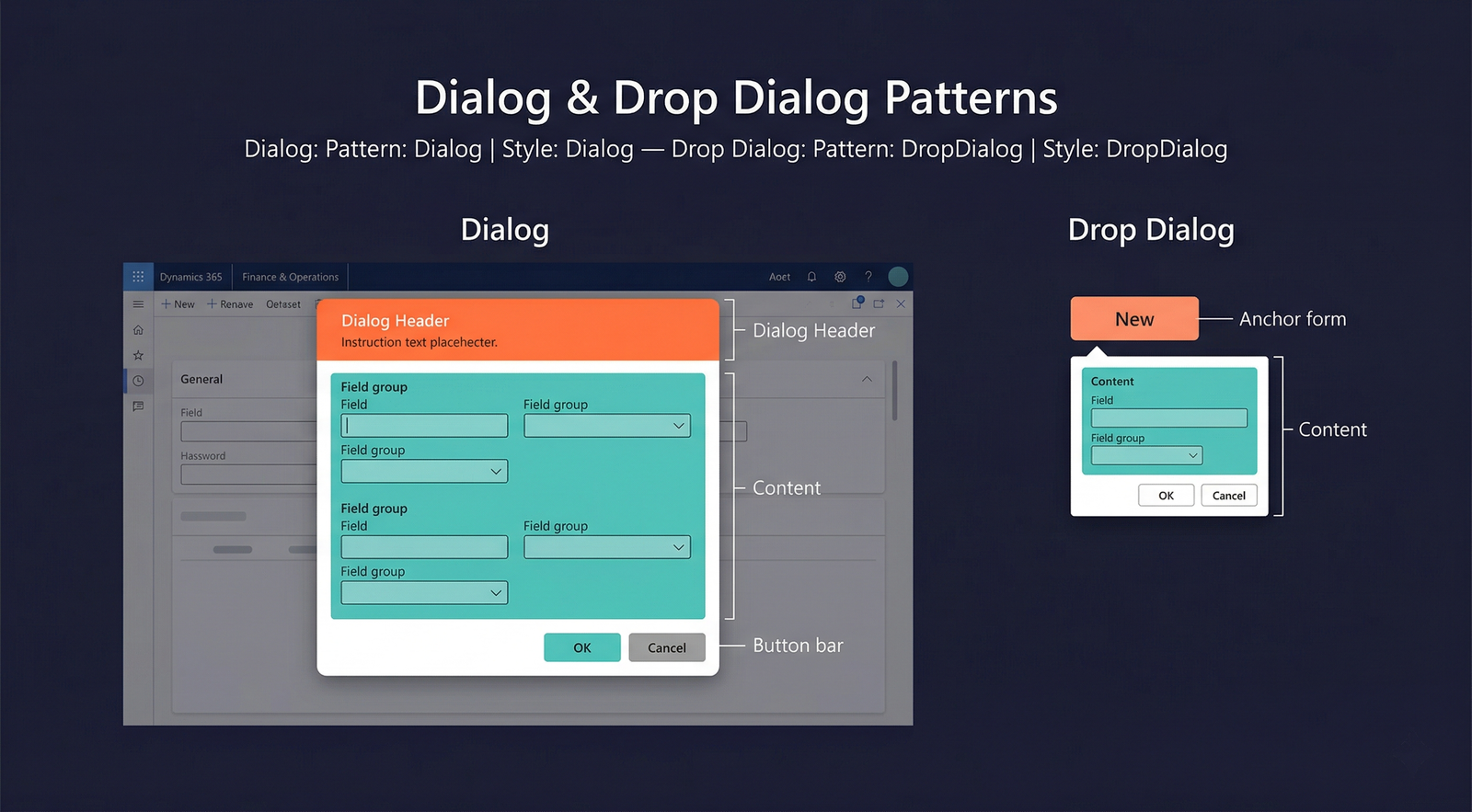
Dialog
When to Use
- A process requires user input before it can proceed (e.g., posting parameters, filter criteria, confirmation prompts).
- The input involves multiple fields that do not fit in a simple message box.
- The form should be modal — the user must complete or cancel the dialog before returning to the parent form.
- The dialog needs its own action buttons (OK, Cancel, and optionally custom buttons).
Variations
Dialog — Basic
A single group of parameter fields between the header and the commit buttons. The most common dialog form.
Dialog — FastTabs
The dialog content uses FastTabs (collapsible sections) to organise a larger number of parameters. Used when the dialog captures complex, multi-category input.
Dialog — Tab
The dialog uses standard visual tabs instead of FastTabs to separate parameters into distinct pages.
Dialog — Read Only
A dialog that displays information but does not accept input. The content area contains read-only fields, text blocks, or information grids. The only action button is Close.
Drop Dialog
When to Use
- The input is lightweight — one to three fields at most.
- The dialog should appear as a dropdown anchored to a button or menu item, not as a full modal window.
- The interaction is brief: the user fills in a value and clicks OK in a single fluid motion.
- Common for quick filters, simple date range selectors, or "New record" prompts that collect an initial key field value.
Variations
Drop dialogs do not have formal named variations. They are always lightweight. If more than three fields are needed, promote the form to a full Dialog.
Key Components
| Component | Control Type | Pattern | Required | Description |
|---|---|---|---|---|
| Dialog Header | AxFormGroupControl | Dialog | No | An optional header group with title text or instructions. |
| Dialog Content | AxFormGroupControl | Both | Yes | The main body containing parameter fields. |
| Field Groups | AxFormGroupControl | Both | Yes | Groups that organise the input fields. |
| Commit Buttons | AxFormButtonGroupControl | Both | Yes | OK and Cancel buttons (framework can generate these automatically). |
Example Forms in D365 F&O
| Form | Type | Menu Item / Context | Description |
|---|---|---|---|
SalesEditLines | Dialog | Sales order → Post → Invoice | The posting dialog for sales order invoicing. Collects posting parameters (quantity, date, print options) before executing the invoice posting. |
InventTransferCreateOrder | Dialog | Inventory management → Transfer order → New | Collects the from-warehouse and to-warehouse before creating a transfer order. |
LedgerJournalPostDialog | Dialog | General journal → Post | Confirmation and parameter dialog for journal posting. |
SalesCreateOrder | Drop Dialog | All customers → New → Sales order | A drop dialog that collects the customer account before creating a new sales order. Appears anchored to the New button. |
PurchCreateOrder | Drop Dialog | All vendors → New → Purchase order | Collects vendor account and order type before creating a purchase order. |
Infographic Placeholder